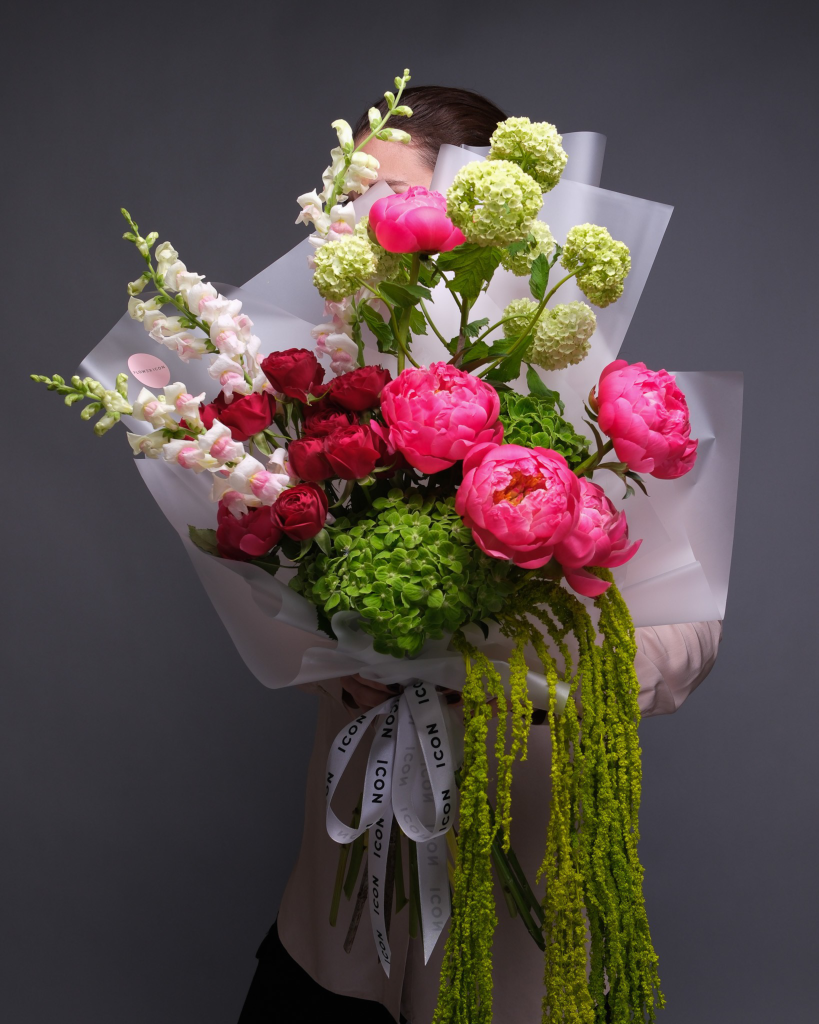
There’s a certain kind of flower arrangement that stops you mid-scroll. Not the grocery-store dozen wrapped in cellophane — the kind where the colors feel intentional, the proportions feel architectural, and you immediately wonder where it came from. In San Francisco, the answer is increasingly Flower Icon (opens in new tab).
The local florist, which operates out of San Francisco and delivers same-day across the Bay Area, has built a quiet following for arrangements that look like they belong in a design magazine. Think French roses in shades of dusty apricot and champagne. Peonies so voluminous they barely fit through a doorway. Orchid arrangements in matte black vessels that somehow feel both minimal and extravagant. Their aesthetic sits somewhere between a Parisian atelier and a contemporary art gallery — which is fitting, given that “gallery” is how the team describes their approach to floristry.
It’s the kind of work that photographs well not because it’s styled for cameras, but because it’s designed with the same eye you’d bring to interiors or fashion. Scrolling Flower Icon’s feed feels more like browsing a mood board than a product catalog. The compositions play with scale and negative space in ways most florists don’t attempt — a single oversized peony against an otherwise empty vessel, or a tightly packed dome of French roses in a palette so specific it could have its own Pantone code.
For Mother’s Day, the studio has released a curated collection (opens in new tab) built around what they describe as “flowers your mom will actually want to keep on the table all week.” That means longer-lasting premium stems — French garden roses, ranunculus, seasonal peonies — arranged in vases and vessels that feel like objects in their own right, not afterthoughts. The collection runs across price points but doesn’t compromise on the visual standard that’s become Flower Icon’s signature: every arrangement is designed to feel like a gift, not an errand.
What makes it all so Instagrammable isn‘t a filter or a ring light. It’s that Flower Icon’s color palettes are unusually considered — muted blush tones alongside deep burgundy, or bright coral peonies against crisp white ranunculus — creating natural contrast that cameras love. Pair one with a sunny windowsill in a Victorian apartment, the Painted Ladies at golden hour, or just a clean marble countertop, and you have the kind of image that performs without trying. It’s the reason the brand keeps showing up in local gift guides and on design-minded feeds across the Bay Area.
And for the procrastinators — no judgment — Flower Icon offers same-day delivery (opens in new tab) across San Francisco and the Bay Area. So even if Mother’s Day planning turns into Mother’s Day panic, you can still show up with something that looks like you’ve been thinking about it for weeks.
In a city with no shortage of florists, Flower Icon has carved out a lane by treating every bouquet like a small creative project. For the mom who has opinions about color theory and keeps a Pinterest board of tablescapes she’ll “get to someday” — this is the one.
The post The SF florist behind the most Instagrammable Mother’s Day bouquets appeared first on World Online.